The challenge
Whislt working at DIG we were approached by Pulse learning to conduct a UX review and redesign of their out-dated e-learning platform, an analysis on what technology to rebuild the new responsive site in and ensure there was a higher sign-up rate to premium content.
User research & wireframing
By the time I joined the project a lot of the UX had already been defined, however as with any project I'm involved in I always like to question and challenge the design and offer fresh perspective. I was able to identify a few areas that I believed could be improved from a technical view point.
Design
With the wireframes in place I began to consider the UI. We already had an existing brand but wanted to look at how we could refresh and breathe some fresh life into it. The logo would remain the same but key aspects such as the colour palette and typography could be adapted.
Moodboards
With an existing colour palette to work from and wanting to adopt a clinical look and feel often associated with healthcare I began to collate some moodboards looking at clean, breathable interfaces.
Colour
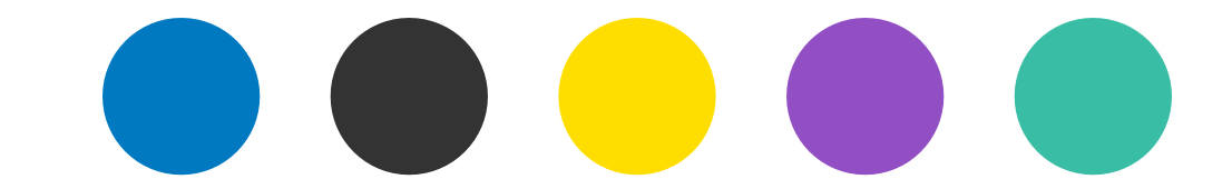
The primary colours in place were blue and yellow but we wanted to bring in some striking accent colours (purple and green) that we could use to make the site look fresh and modern.
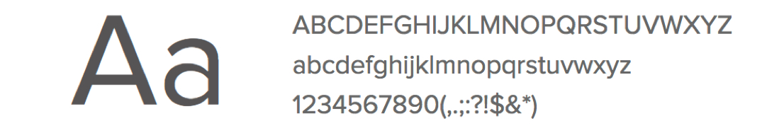
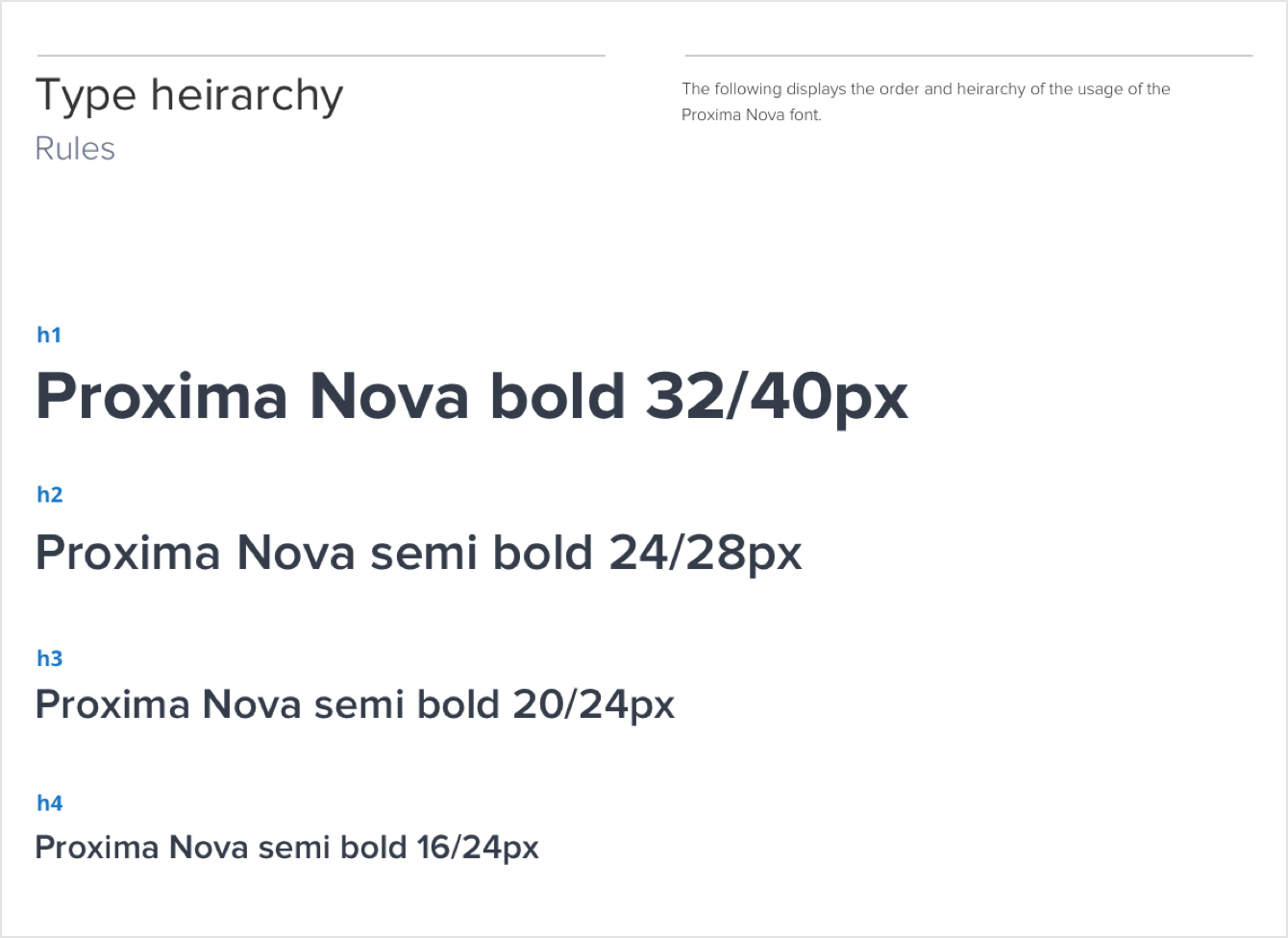
Typography
Initially we chose to go with the typeface lato but knowing that the focus of the site was the dashboard we switched to Proxima Nova for it's legibility at small font sizes. It's range of weights also allowed us greater flexibility.
Iconography
The consensus from the start was to avoid using icons as we wanted the typography to provide meaning using various font weights. Any iconography we did use would become more of a feature and be more illustrative.

Mockups
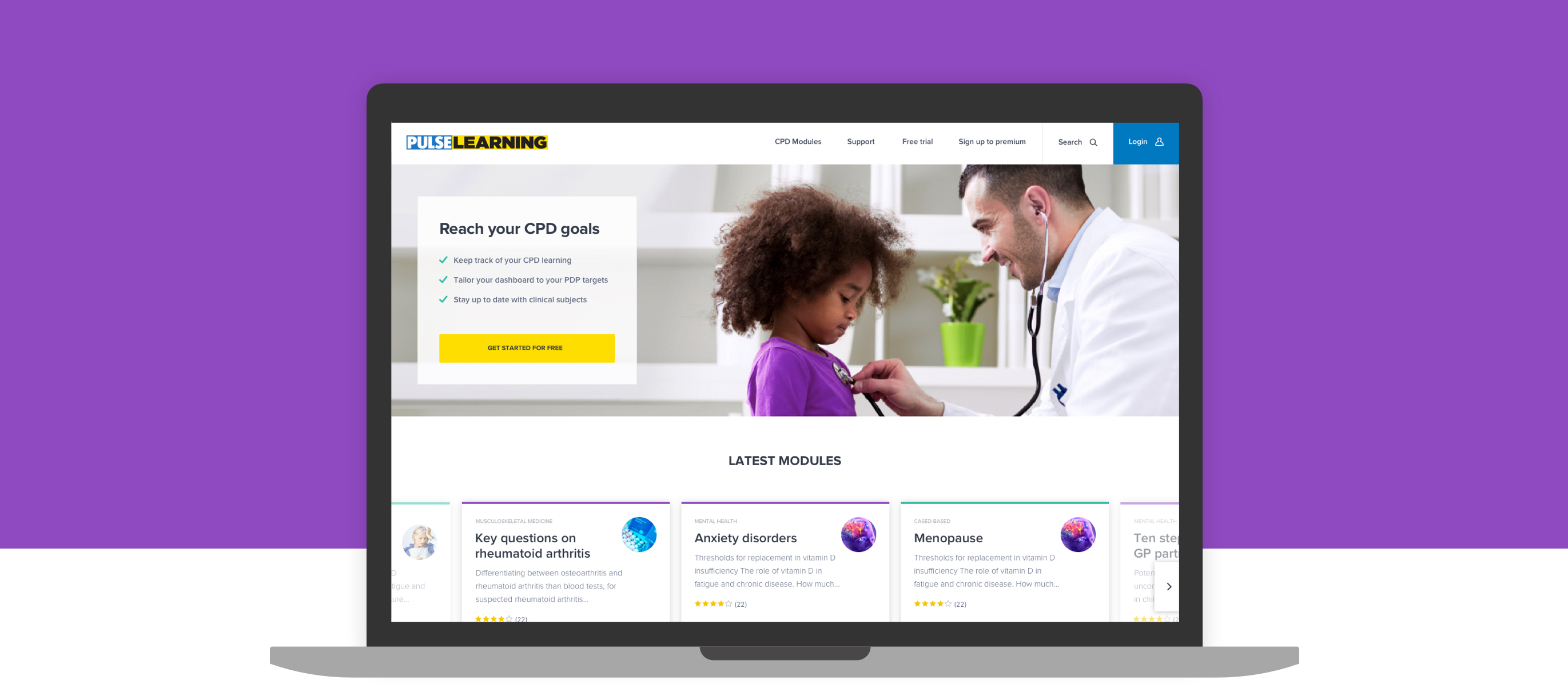
With the visual references in place I began to design the key pages starting with the dashboard.
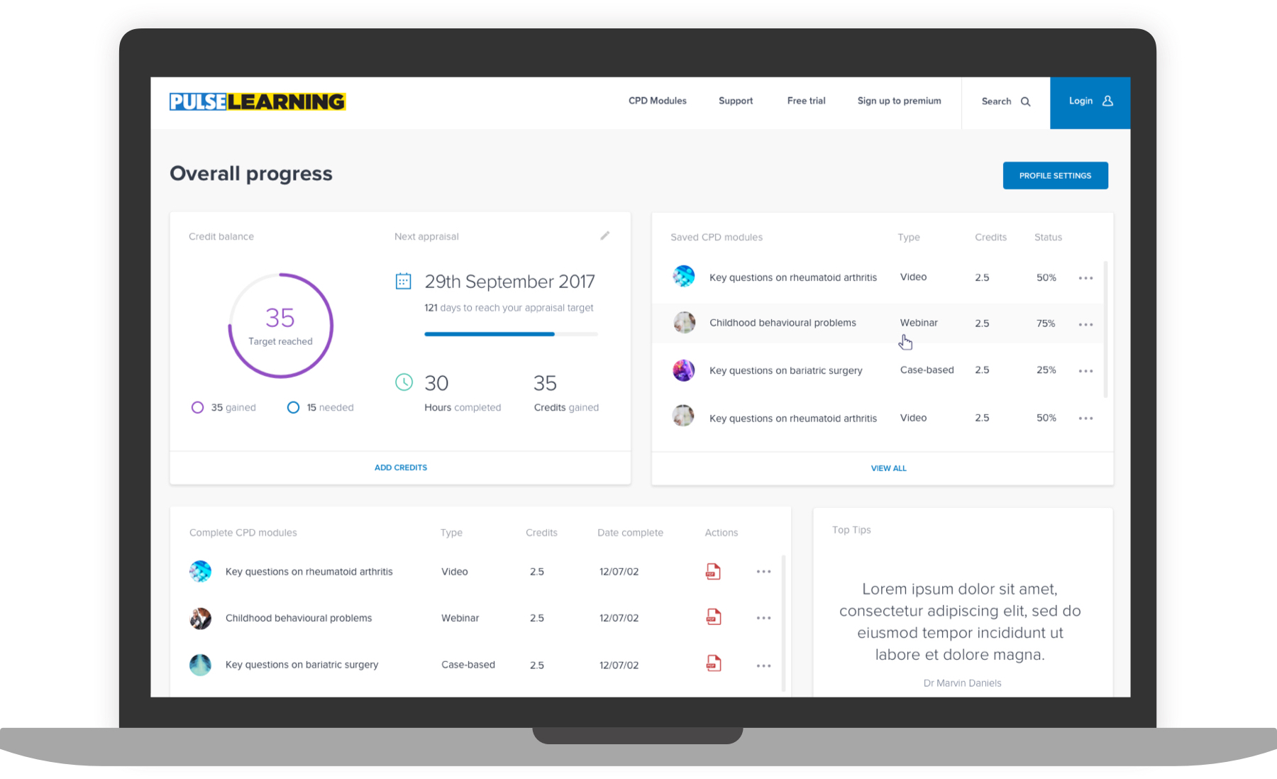
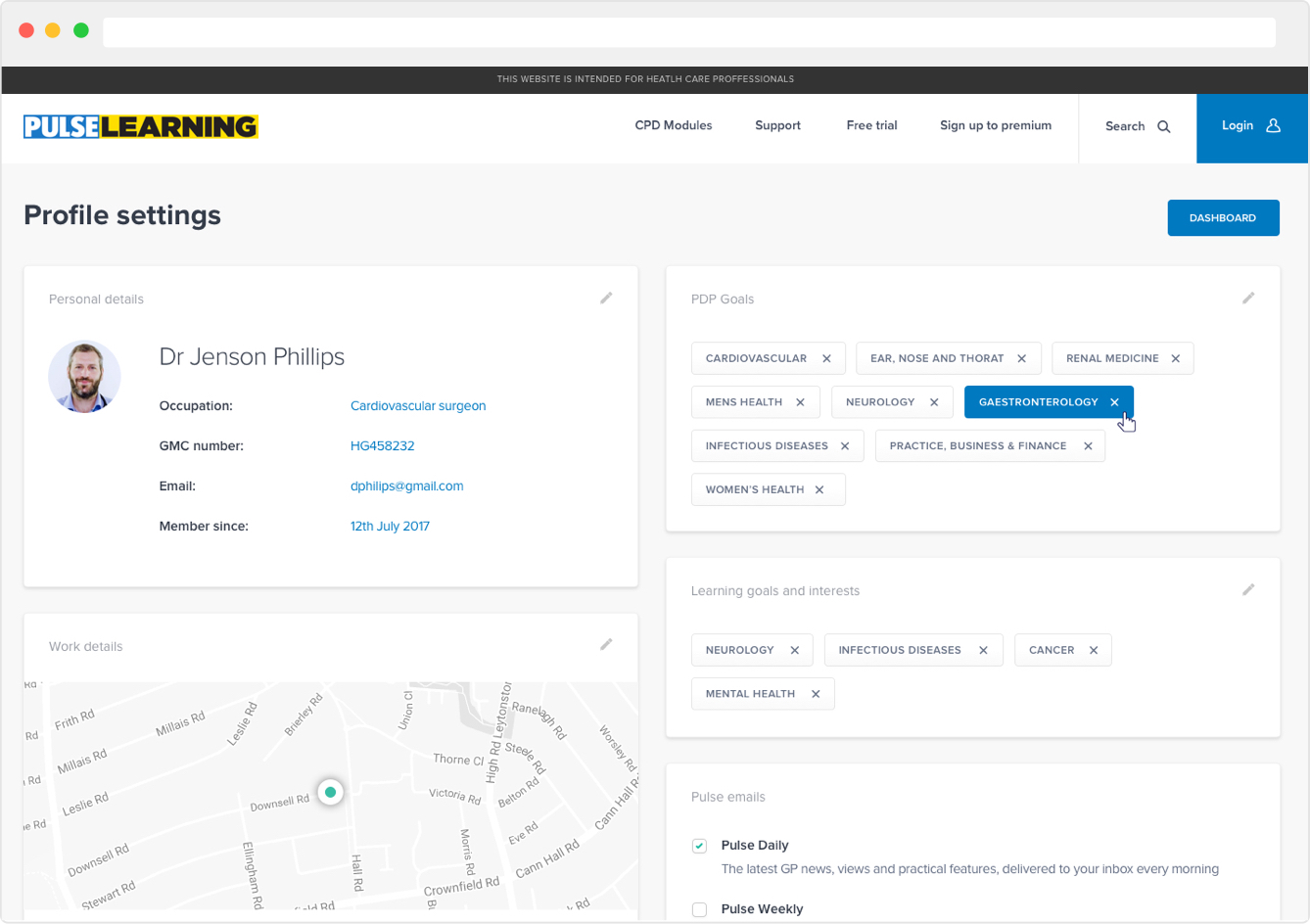
We split the page sections into panels to group key content and allow them to be lifted and reused on other pages. This also allowed us to create a modular based design that would work effectively from a responsive point of view.
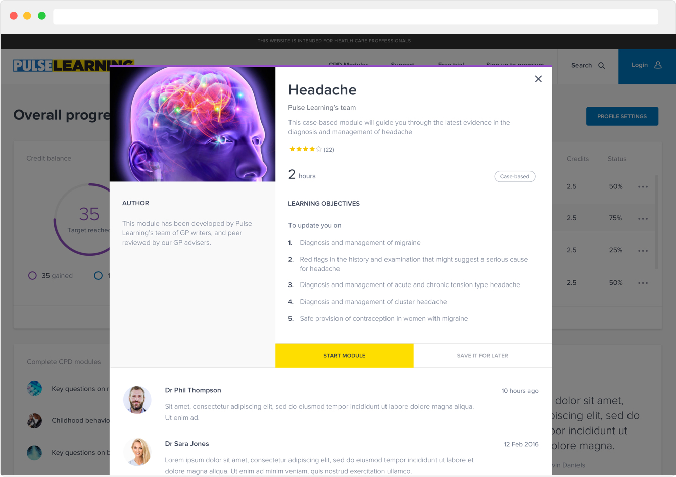
Modals were adopted to keep users on the dashboard and offer quick overviews of the CPD modules.
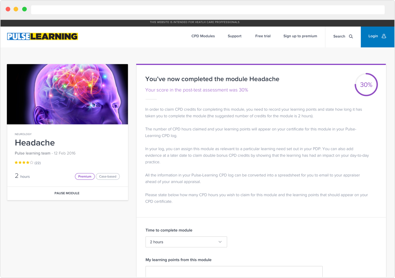
Colour was used sparingly to draw attention to key information.
Building components
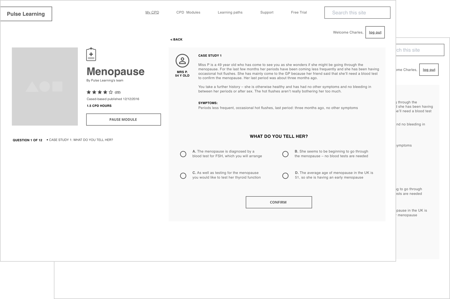
Once the key pages had been designed and approved by the client we began to further break the designs into components that could be documented and used to design the rest of the pages.
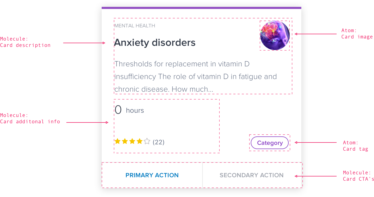
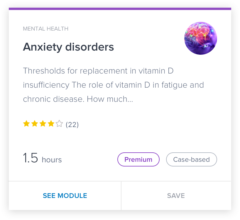
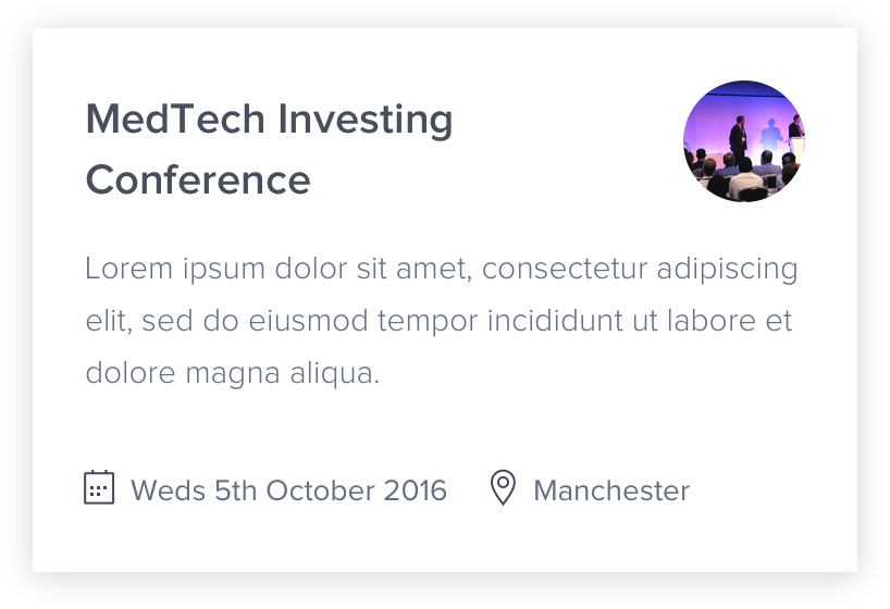
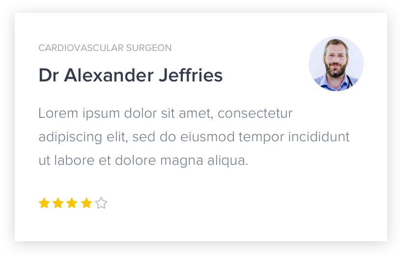
As there are several different content cards used across the site we wanted to design them in a way that made them flexible and reusable.
Adopting an atomic methodology we broke the cards into molecules and atoms which could then be used to create different layouts across the site.
As the only molecule that is mandatory when instancing the card component is the Card details (as it contains the title and description) all other molecules and atoms are optional.
Below are three examples of different cards used across the site. Allthough they have very different functions the aspects of the design are the same.
Pattern Libraries
In order to keep consistency and avoid unnecessary repetition I set up a pattern library in sketch so myself and any designers moving forward could have a repository to pull in UI elements and components. This included font styles, form elements, buttons and content cards. .
Documentation
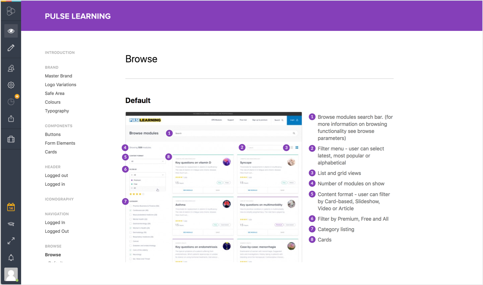
A requirement of Cogora was to create a source where employees could grab all brand and associated assets. With the goal to create an inhouse design and development team in the near future it was essential to also create a guide where we could communicate all are our design decisions and offer a description of the technologies and functionality included in the website. Frontify offered the perfect solution as it allowed us to define the brand, outline the UI kit and provide code snippets and links to prototypes.
Get in Contact
Let's work together
If you like what I do and think I could be a good fit for a project or simply want to get in touch please drop me a line here.
Say hello