- Services
- UI/UX
- Deliverables
- Wireframes
- Web mock ups
- Prototypes
- Pattern Library
- Software
- Sketch
- Marvel
- Zeroheight
The Challenge
When I joined Baymard there was no design team in place. As a startup, the founders would outsource any design work or do it themselves on the fly. This was perfectly acceptable but it soon became a challenge as the company grew and they found themselves spread too thin. Asset folders become bloated and discorganised, consistency was difficult to maintain and allthough some rules had been put in place it was becoming hard to manage. It was time to get a dedicated person who could manage the design at Baymard.
We need a system
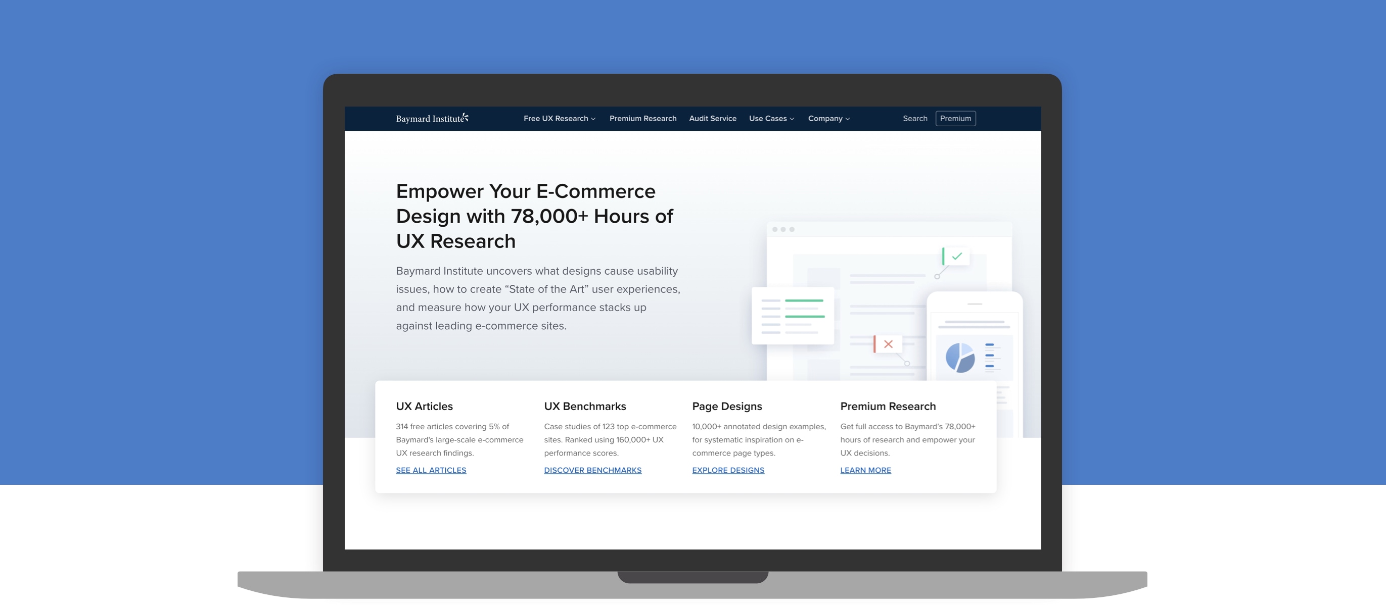
One of the main reasons for hiring me was so I could build and maintain a design system and bring order and consistency to the website and the different marketing channels.
Grid
One of the first things I did was to create a grid system to bring structure to our designs. These grids would go on to form the base of a boiler template that could be opened as a preset within Sketch to speed up time.
Spacing
The next task was establishing a baseline grid to help define how UI elements and components should sized and to create a consistent vertical rhythm across all screens.
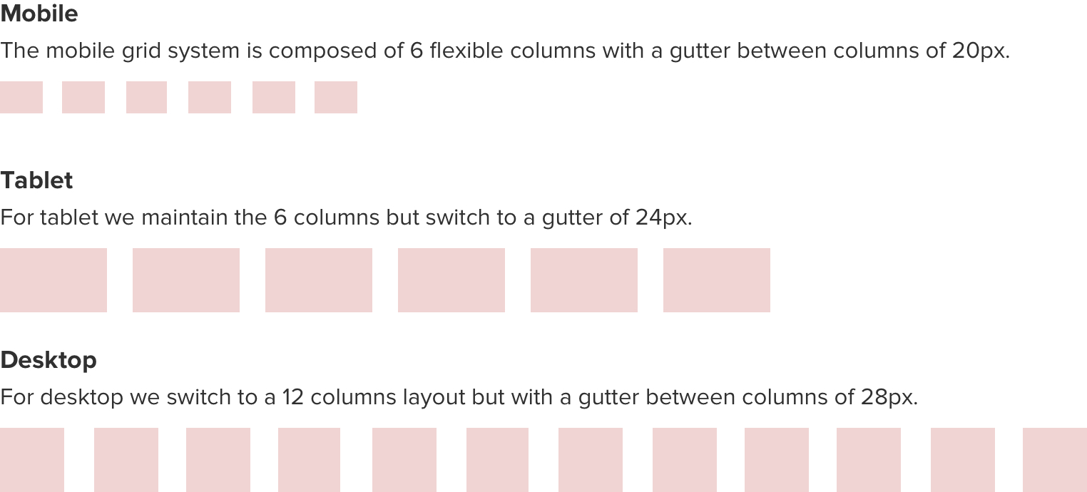
Breakpoints
The Baymard website was already built responsively but it was necessary to redefine the exact breakpoints to give us greater flexibility and an improved sense of order forward. With 85% of our users viewing Baymard’s Research on large desktop screens we knew designing our content for mobile devices wasn’t a priority but was still essential knowing the importance of having our content accessible to all audiences. .
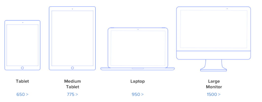
Image Repository
Creating a space where team members could grab images and assets was imperative. Baymard is a very organised organisation but the graphics, design files were loosely bundled and nested in many poorly named folders making it difficult to locate brand assets. It was clear that creating a well structured repository would help alleviate this issue and speed up Baymard’s workflow.
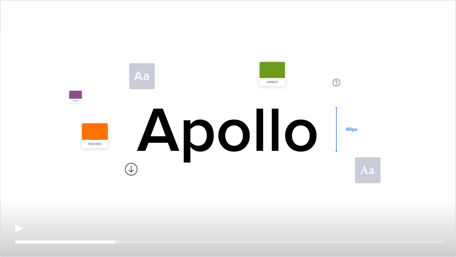
UI Kit
I then conducted a visual audit of the site and put together a list of the different UI elements being used in order to form the base for a UI kit. This was an opportunity to look for inconsistencies and highlight any rogue elements that could be removed in order to reduce the number of unnecessarily unique elements across the site. This was also an opportunity to give the website a design refresh and update many of the components as well as working on a new font stack, fresh colour palettes and a refreshed icon set.
With some basic rules defined and a UI Kit in development it was time to consider how this new system could work for the wider team. It’s perfectly acceptable to have a UI kit in place but with no rules around how to use it, it becomes nothing more than a collection of building blocks with no guide on how to assemble the pieces
The idea was to build a pattern library using the atomic design model, where you start by defining the most basic elements (atoms) such as the buttons, font styles and icons and demonstrating how they can be grouped and joined to create more complex molecules, organisms and templates.This would be useful at allowing team members to create layouts with very little design knowledge.Working with the developer to set up their code base
Designing a Feature
Baymard has a clear method for executing projects, whereby all projects follow a detailed multi step process. This systematic approach allows them to maintain a very high level of consistency and guide team members to avoid common pitfalls. Although helpful for the projects I would be involved in, it is not specifically targeted at design so it felt necessary to create a separate design process. Using Baymards method as a base I looked at how we could create a series of steps to help guide a project from concept through all the way through to being deployed.
Business Objectives
Every project begins with a conversation with the Stakeholders to discuss why we want to do this? What value will this new feature bring the company, how will it help improve our relationship with our customers, what is the trade off between time and value.
Use Cases
We then spend a significant amount of time understanding what is important to our customer. Why do they want this feature? What value does it offer them? What do they need to achieve whilst using the feature and how will it improve their experience?
Constraints
We then discuss any technical dependancies that might prevent us from going down a certain route. We look at our resources and time frames and think about how realistic it is to get a a feature out to market. Where does it rank alongside other projects and features.
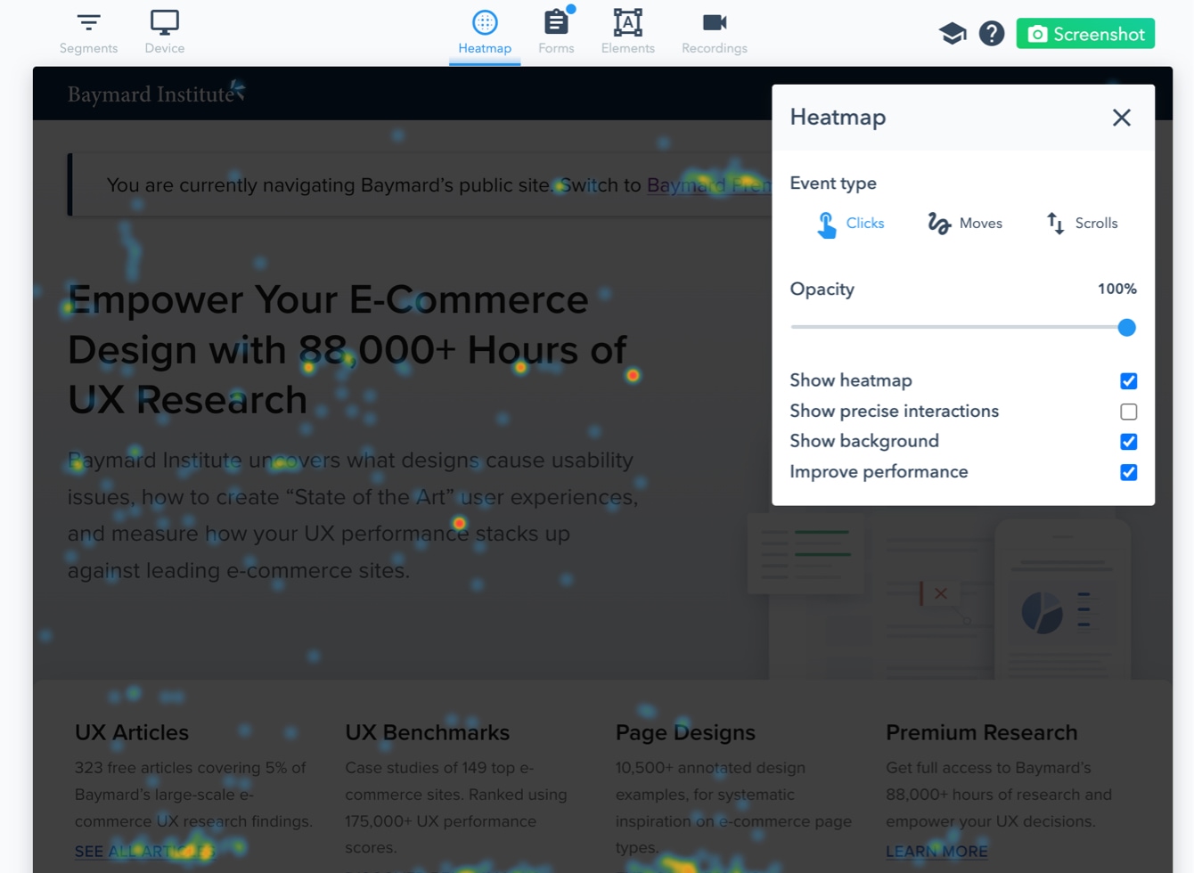
Analyzing Data
A benefit of working on an existing website is that it’s easy to look at existing data and analytics to get a sense of where improvements can be made. I was able to use Lucky Orange’s Dynamic Heatmaps whilst working at Baymard to track user behaviour on their website and identify which features and elements are being engaged with and which are being outright ignored.
Concepts
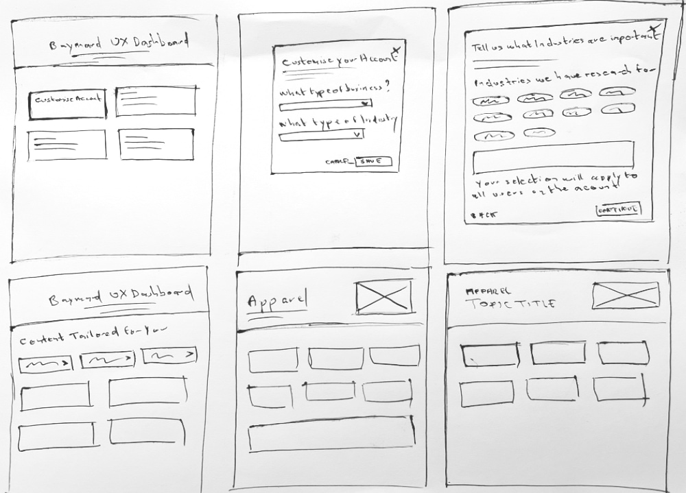
Where possible I like to produce low fidelity sketches to help conceptualise ideas. It’s a step which I sometimes skip when the outcome of the project is clear but for projects that are more complex and require a greater level of exploration it’s a very effective way to quickly work through ideas. Once I have explored this sufficiently I then move onto the wireframing stage to present my ideas in greater detail using Miro to upload and share my ideas with the team.
Choosing a Concept
As a designer you want to produce the best work regardless of cost but for a Startup this obviously isn’t practical. Depending on the weight of the project or what resources are available it’s often necessary to go with a design that although basic in form, will get the product to market much quicker.
During the design phase I find it useful to group the concepts based on complexity so we can broadly evaluate what value the additional time spent developing a certain feature will give us. If we love a particular UI but the cost exceeds the perceived value then we will go with a more basic design and enhance the UI further down the line when resources become available and we’ve been able to evaluate how well the product has been received.
MVP
I usually start by designing something very basic. Coming up with ideas that are simple in function but are well structured and attractive to look at.
Common UI Pattern
I then look at trends across the web and create a series of concepts that can be considered as common or good practice. Working for a UX Research Agency has the benefit of being able to browse our own research and advice for what constitutes a good UI.
Advanced
I then move into an ‘advanced’ stage where I look at ideas that are potentially more difficult to build but offer increased value to our users.
Projects
I was fortunate to work on a number of really interesting projects during my time at Baymard. From redesigning the search and navigation to the creation of brand new tools and products.
Navigation
One of the more significant projects I worked on at Baymard was redesigning the navigation. This involved an extensive site audit followed by a series of card sorting exercises to map out an improved ia. One of the main aspects we wanted to improve was how we provide onward journeys for our users and help them discover new content. A mix of abstract language and a lack of context meant it was challenging for users to navigate our site.
Alongside a redesign of the header and footer, we also created a series of cards and CTA’s to improve cross navigation as well as a series of secondary navigation elements to help users navigate content heavy pages. We also looked at how we could encourage users to sign up in a less forceful manner by only revealing subscription CTA’s when users delved further into a subject instead of blocking them with obtrusive banners and pop ups.
Guidelines
Redesigning our guideline pages was something we wanted to get right. A look at our analytics revealed this was the most visited area of our website by a mile.
One interesting feature was a progress bar to show users where they were on the page but more importantly indicate how much of the page they had read. Although the inpage navigation did a lot to solve this problem it couldn’t account for some sections that were infinitely longer than others. Designing a progress bar that grew in height as the user scrolled the page felt like a useful way to indicate how far the user had travelled the page.
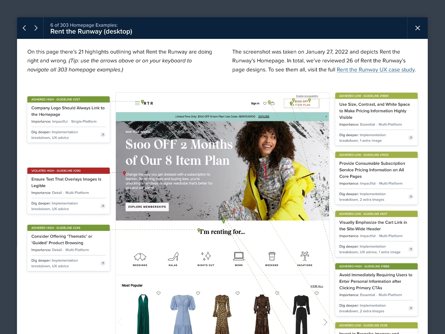
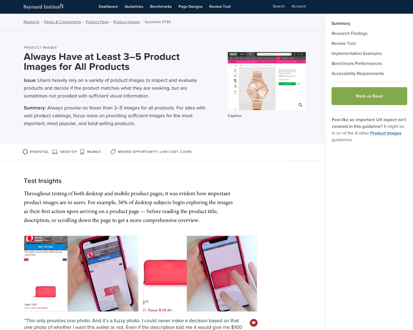
Page Designs
One of Baymard’s main offerings is a vast collection of page designs that show where different UI’s succeed and fail. Each design includes a series of annotations summarising the advice from the guidelines. They offer a quick way for users to work out where their website might be going wrong without the need for delving too far into the underlying research. Given that any design can have anywhere from 1 to 50 annotations we needed a design solution that was compact but easy to scan.
Premium Research
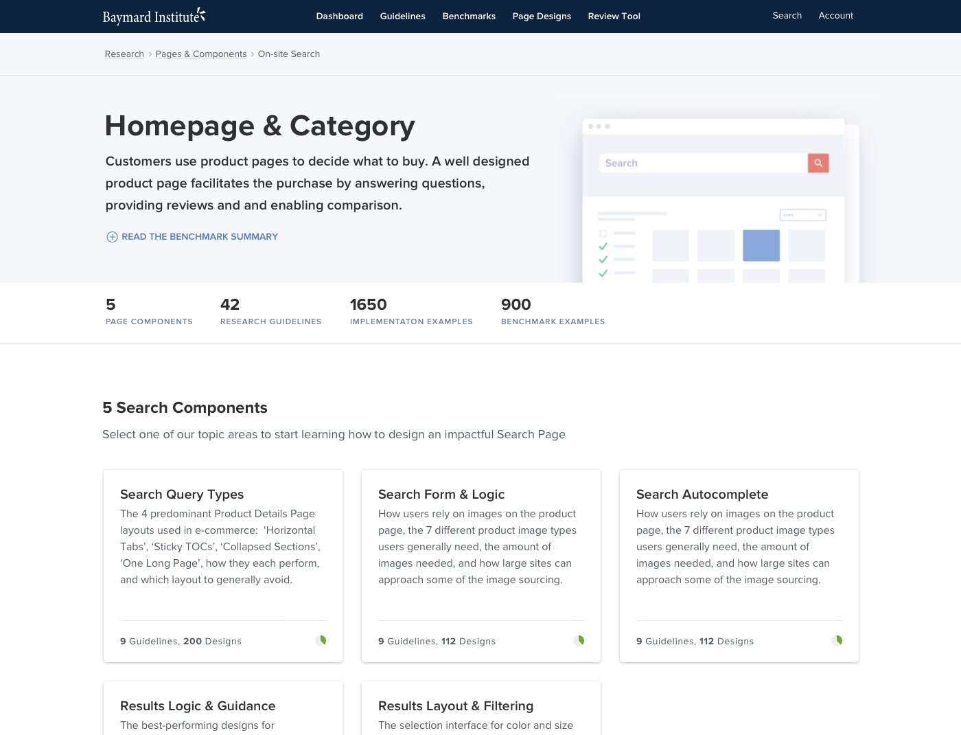
With a catalogue of 700+ guidelines growing larger by the week, we knew we needed to revisit how users find and access our content. We already had structures in place to help users target specific areas on their site (e.g. the homepage) but with an ever growing collection of research findings we needed to create new structures to help users to find the most relevant content to their company. Our idea was to introduce new Industry structures so somebody working in Apparel could find all the examples relevant to that Industry without having to look at relatable but not specific examples (eg Homepage examples for Home & Hardware sites).
As the guidelines are deeply nested under different themes and topics pages we knew that introducing a new industry level would add another layer of complexity, so it was essential to design a new landing page and clearly identifiable pages to help users recognise where they are whilst traversing through the content and to prevent them getting lost.
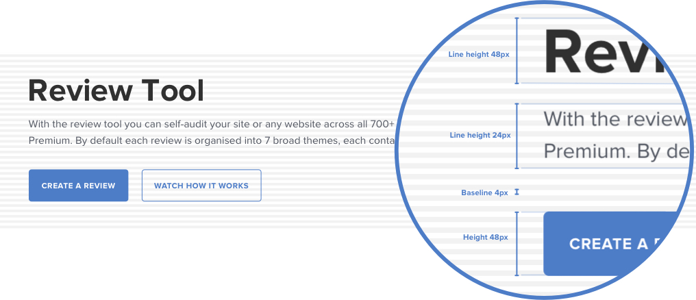
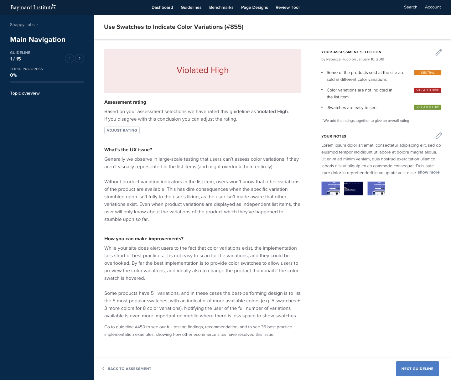
Review Tool
Perhaps the biggest project I worked on at Baymard was a tool allowing premium users to audit their own website. Users could assess their website against Baymards collection of guidelines through a series of instruction based screens resulting in a series of individual results that would collate to form an interactive scorecard and a series of high level takeaways.
Get in Contact
Let's work together
If you like what I do and think I could be a good fit for a project or simply want to get in touch please drop me a line here.
Drop me a line