The challenge
I was challenged by EuroStar to redesign their current booking flow with the aim to promote and help users understand their different ticket classes.
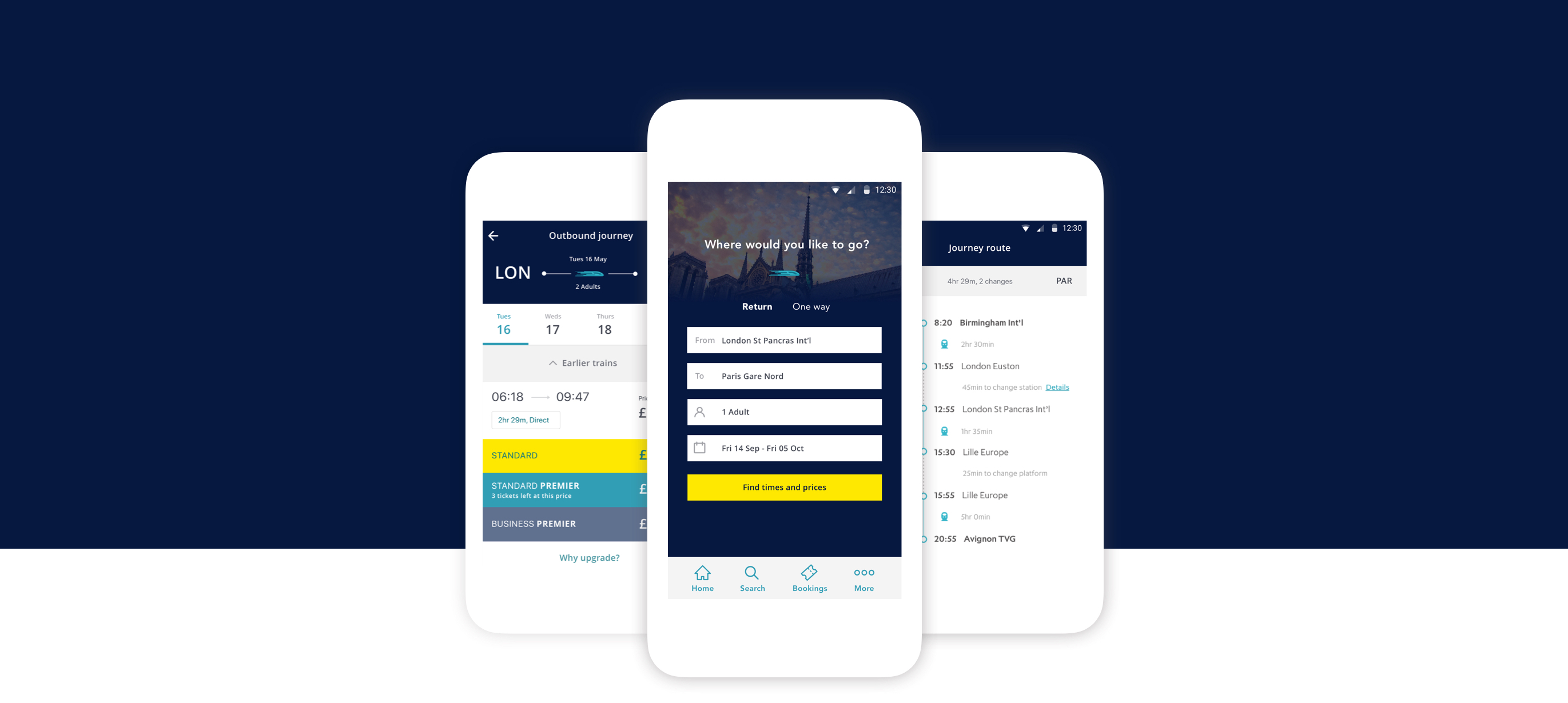
Mockups
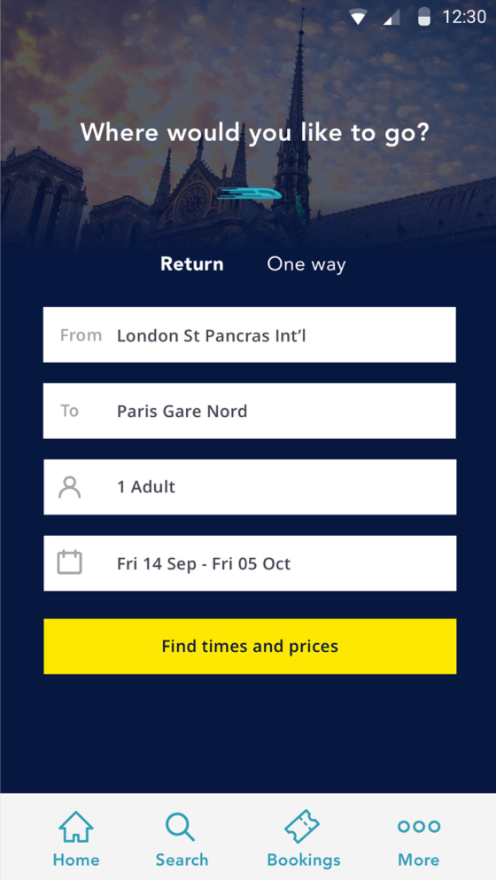
Search
A feature of my concept was the use of photography on the search page. Usually I would avoid adding imagery to form pages but I felt in this instance it could be a simple way to entice and encourage the user.
I also updated the iconography opting for a simple key-line style with rounded corners.
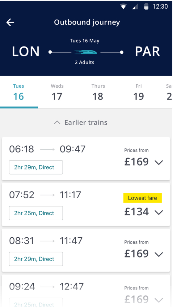
Results
I wanted to clean up the current results page by removing the 3 columns of ticket prices and showing a single 'starting from' price that could be expanded to see further options. This is where I felt there was room to promote the upgrades by including a why upgrade link that would slide in a detail page over the top.
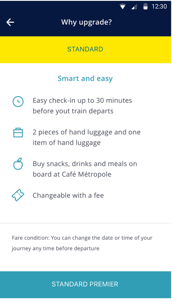
Upgrade
I wanted to tie the upgrade detail page to the results page by including headers that adopted the same colours as the upgrade classes. The features of each upgrade could then be clearly listed below with simple iconography and a leading message.
Prototyping
I created several animation samples in Flinto to demonstrate how certain features would transition.

Demo 1
Demo 1 shows the fare card expanding to reveal the different classes and why upgrade link.
Demo 2
Demo 2 shows a scrolling animation where the header becomes compact to create more page space.
Get in Contact
Let's work together
If you like what I do and think I could be a good fit for a project or simply want to get in touch please drop me a line here.
Say hello