The Challenge
When I joined Baymard, there was no in-house design team. As a growing startup, the founders had been managing design tasks themselves or outsourcing them as needed. However, as the company scaled, this approach began to reveal its limitations. Design assets became disorganised and difficult to maintain, consistency across projects started to slip, and existing guidelines were no longer sufficient to support the increasing volume and complexity of work. It became clear that a dedicated design role was needed — someone who could establish structure, bring clarity, and build a cohesive, scalable design system for Baymard.
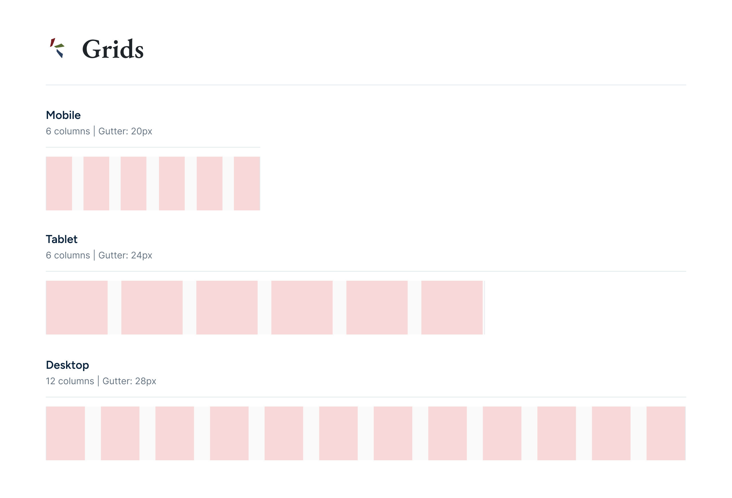
Foundations
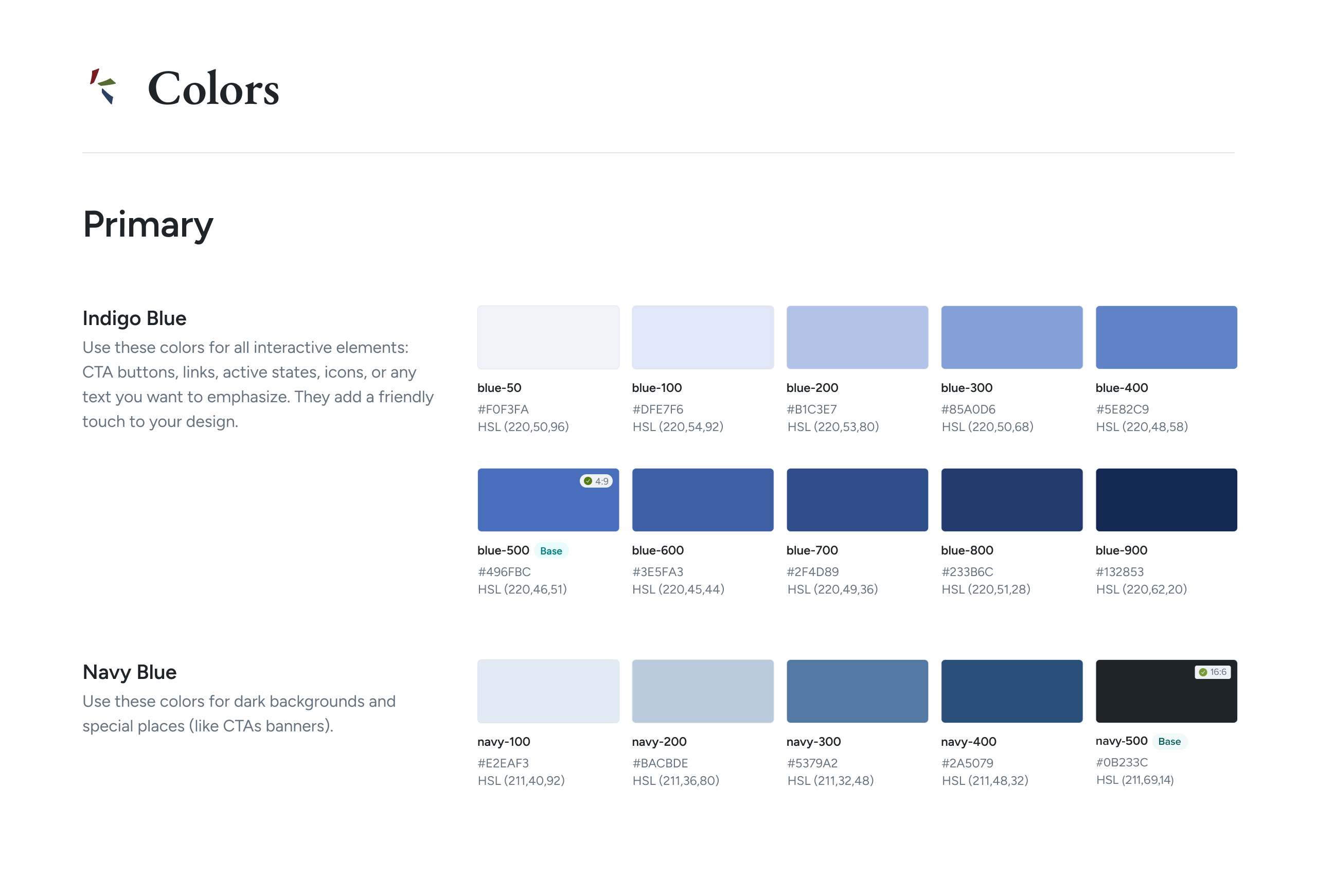
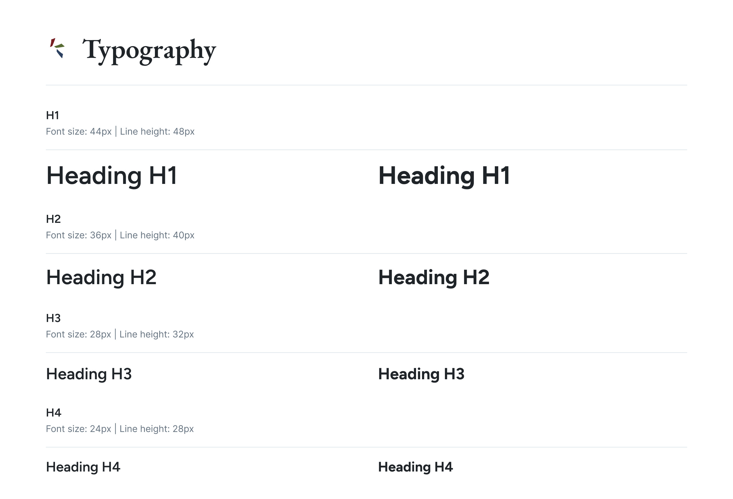
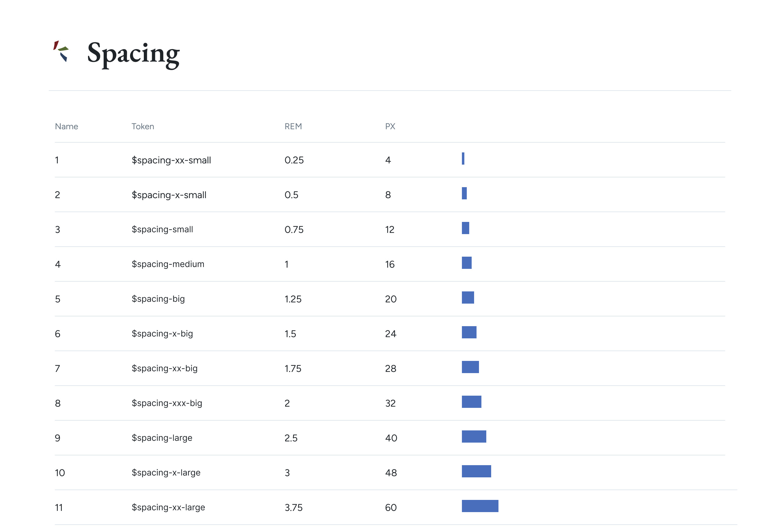
To address the growing need for consistency and efficiency, I began by establishing a comprehensive set of design foundations. This framework was created not only to streamline my own workflow, but also to serve as a guide for other team members and ensure alignment with the development team. I introduced a colour palette, a scalable typography system, and clear guidance on spacing, grid layouts, and asset usage. These foundations allthough not perfect provided a shared visual language across the organisation, helping to improve collaboration, speed up the design-to-development process, and maintain a consistent user experience as the product evolved.
Training Platform
During my time at Baymard, I helped design a remote, self-paced training platform aimed at individuals looking to build a career in e-commerce UX. The platform was designed to be accessible to people from all backgrounds and skill levels, offering structured learning paths and three tiers of certification. Rooted in Baymard’s extensive UX research, the program guides users through a series of modules and six exams, ultimately awarding the “Certified by Baymard Institute” credential. The platform not only provides practical, research-based education but also offers public recognition to help users advance their careers in the UX industry.

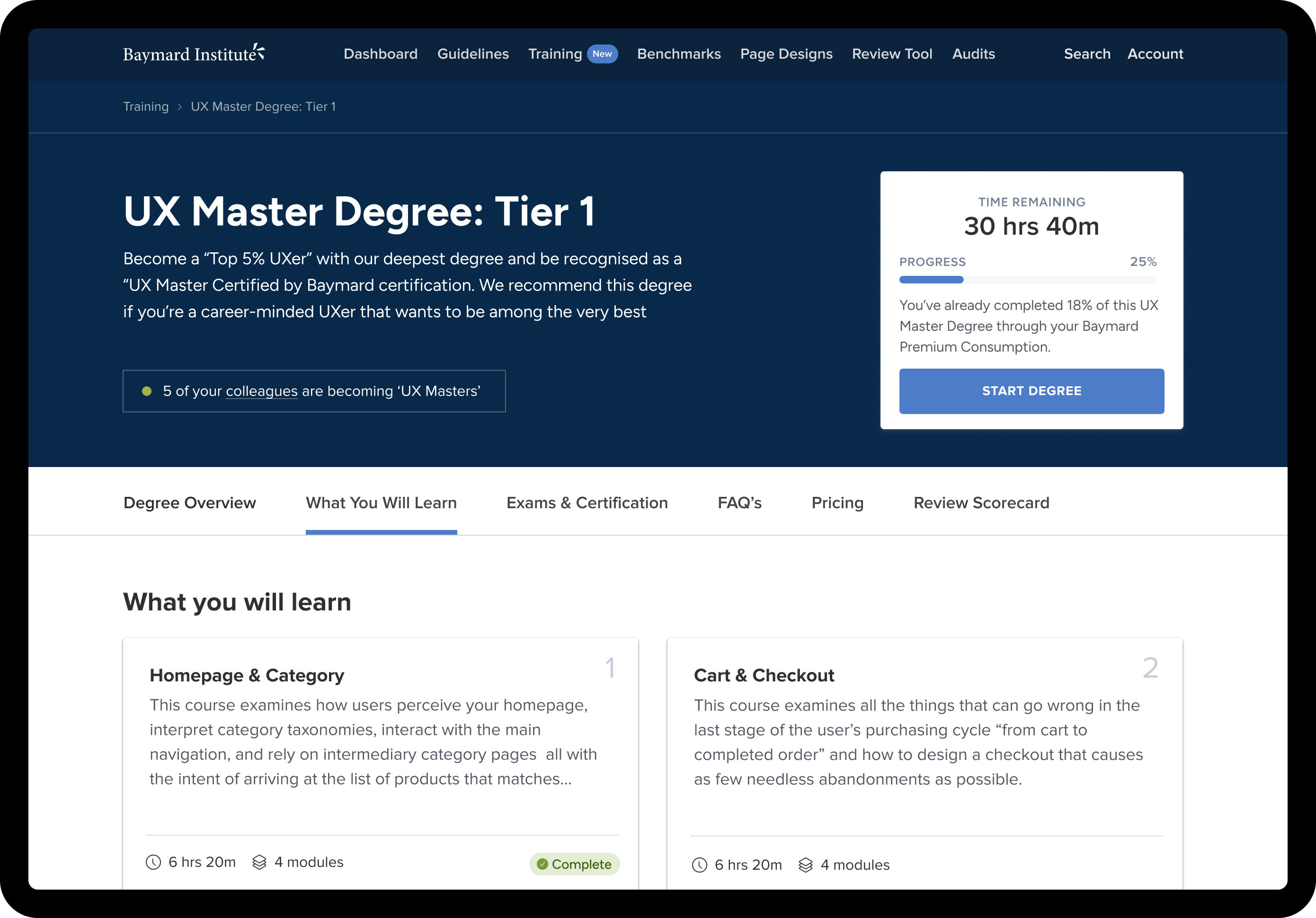
Degree Pages
As part of the training platform, I designed the Degree pages to give users a clear, structured overview of their chosen program. These pages track individual progress through each module and exam, offering a dynamic scorecard that updates as users apply their learnings in real-time. A core feature allows users to review their own website alongside the course material, assessing it against best practice UX guidelines as they progress. This hands-on, incremental approach not only reinforces learning but also helps users build a practical, personalised portfolio of insights by the time they complete their certification.
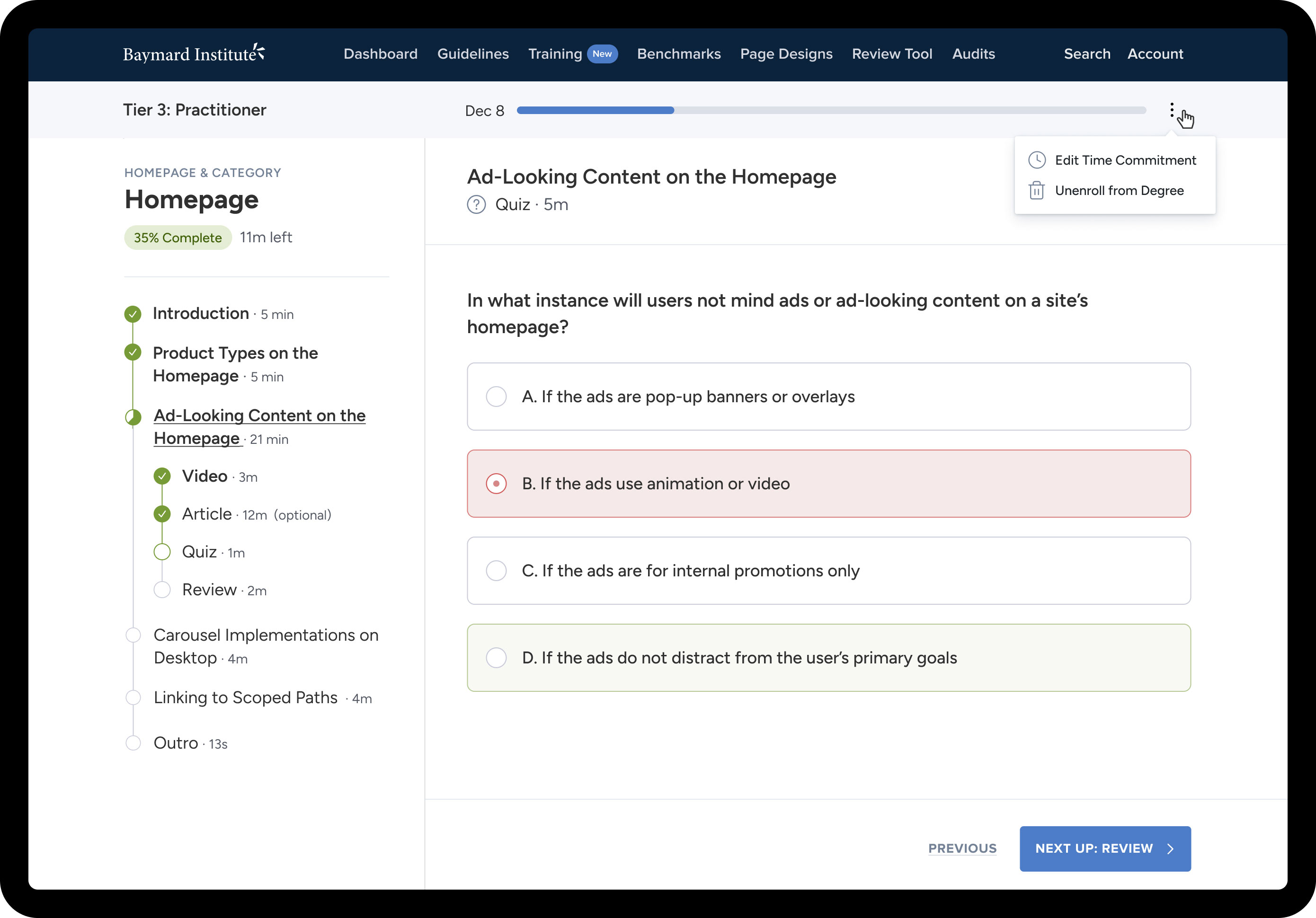
Activity Pages
I designed the Activity pages to guide users through training videos, articles, quizzes, and practical reviews across various e-commerce page types. The focus was on creating a clear and intuitive experience that made it easy to navigate, stay engaged, and track progress. Consistent layouts and thoughtful design helped users move smoothly between activities while maintaining focus on their learning goals.
Design System
Rather than launching with a fully defined system, the design foundations evolved gradually as I worked through early projects. This ad hoc approach wasn’t ideal, but it was a practical solution given our small team and limited resources. It also offered creative flexibility to shape the product’s look and feel without immediate constraints. Over time, these explorations formed the basis of a scalable design system, providing the core building blocks for components, patterns, and templates as the team grew.
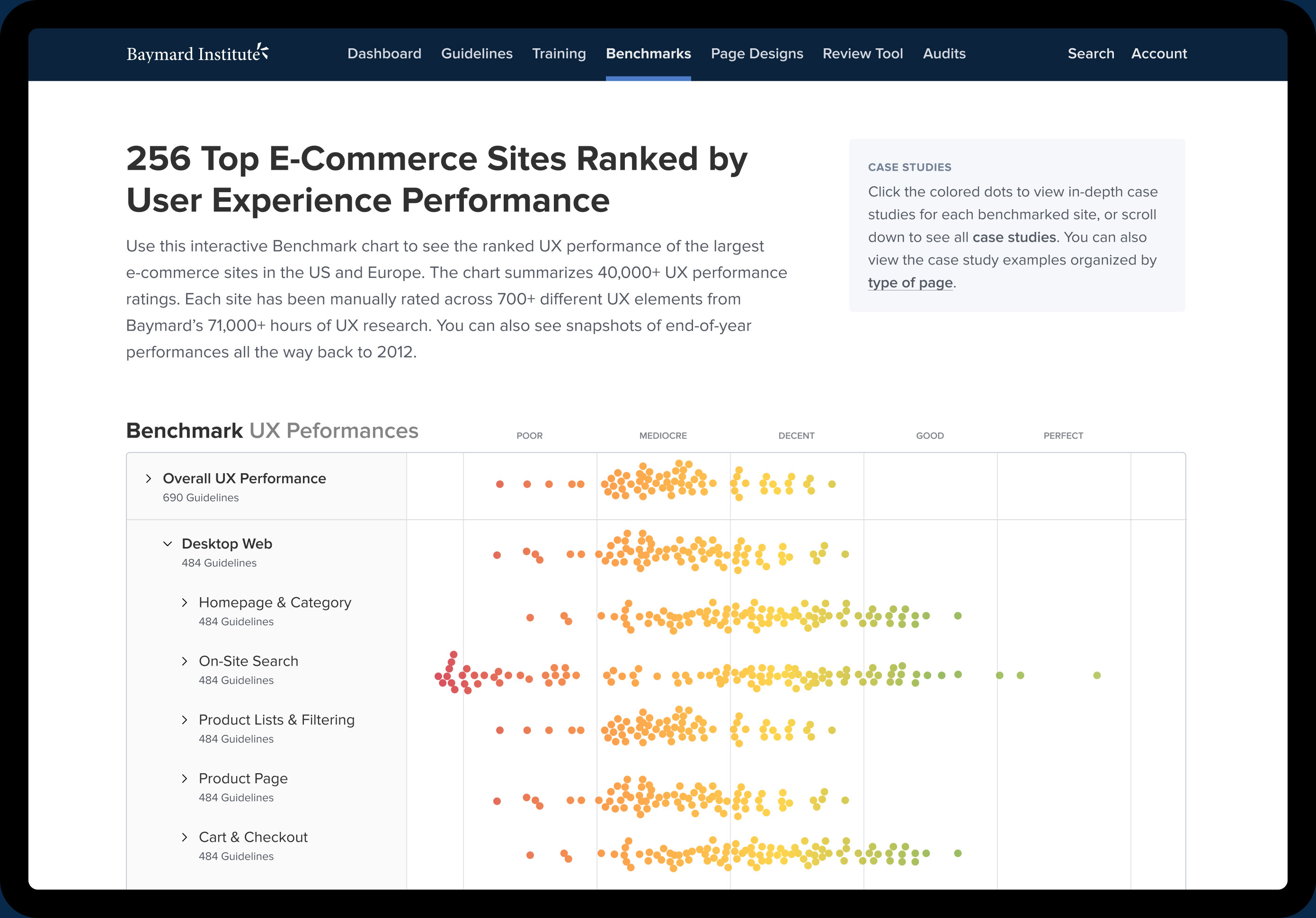
Premium
I contributed to designing a suite of premium tools and services that enable customers to gain valuable e-commerce UX insights by analyzing the performance of leading e-commerce sites across the US and Europe. A significant part of the design work involved organizing and visualizing large volumes of complex data in a clear and accessible way. These tools empower users to create state-of-the-art shopping experiences by learning directly from competitors’ successes and avoiding common design pitfalls. By providing clear, actionable data and comparisons, the platform supports smarter, research-driven decision-making for e-commerce UX design.
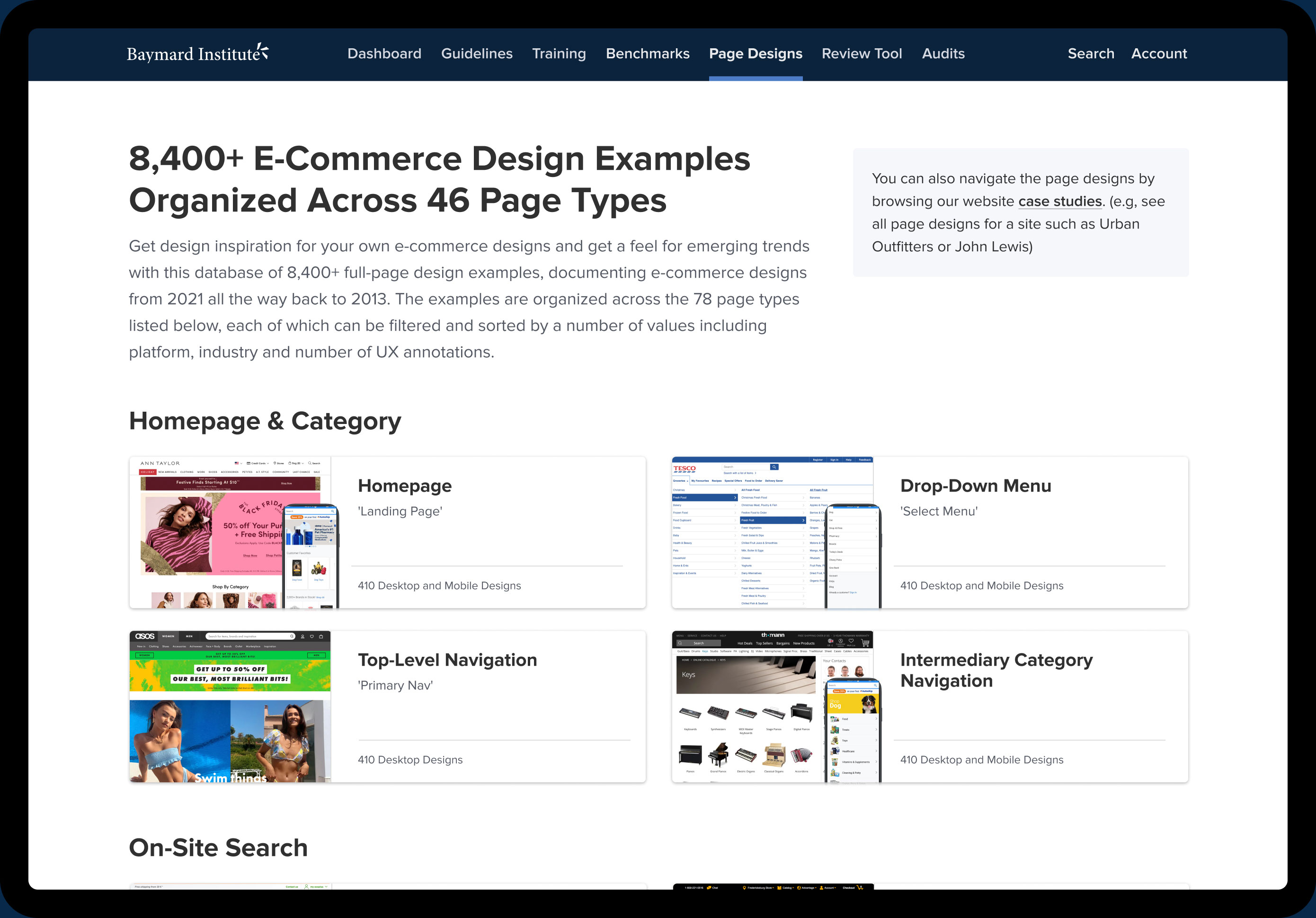
Page Designs
One of the projects I worked on was a page design tool that serves as a source of inspiration and insight by showcasing thousands of annotated, full-screen designs. The tool highlights how leading companies perform against our UX research criteria, helping users identify emerging trends and best practices in e-commerce design. This upgrade focused on improving usability and visual clarity to make it easier for users to explore examples, understand annotations, and apply insights to their own projects.
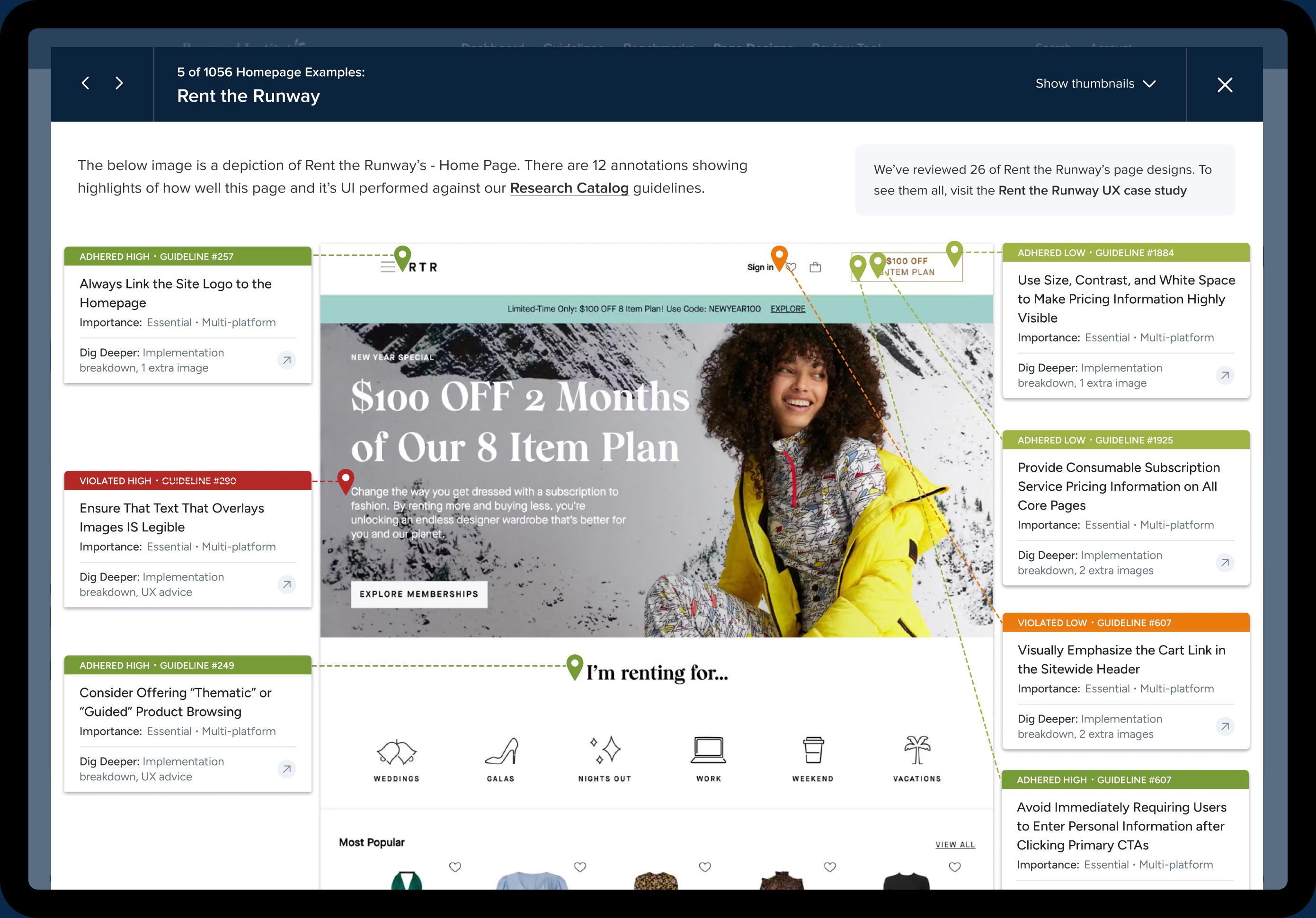
I designed the interface for the page design tool to clearly present large amounts of data without overwhelming users. The goal was to help users easily identify which components on each page performed well, which didn’t, and where action was needed. To support this, the interface highlighted key insights and performance indicators, making it simple to scan, interpret, and prioritise improvements.
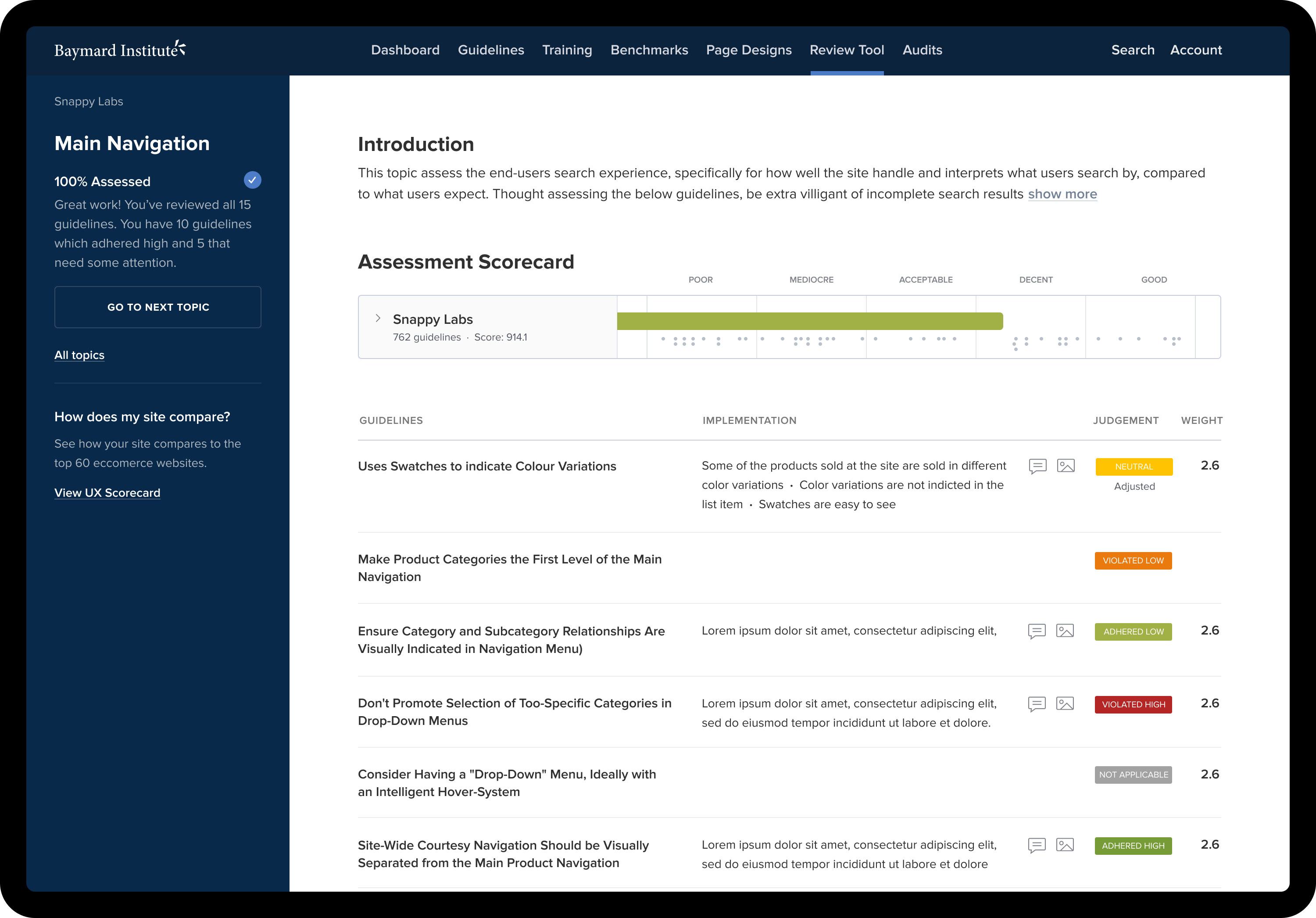
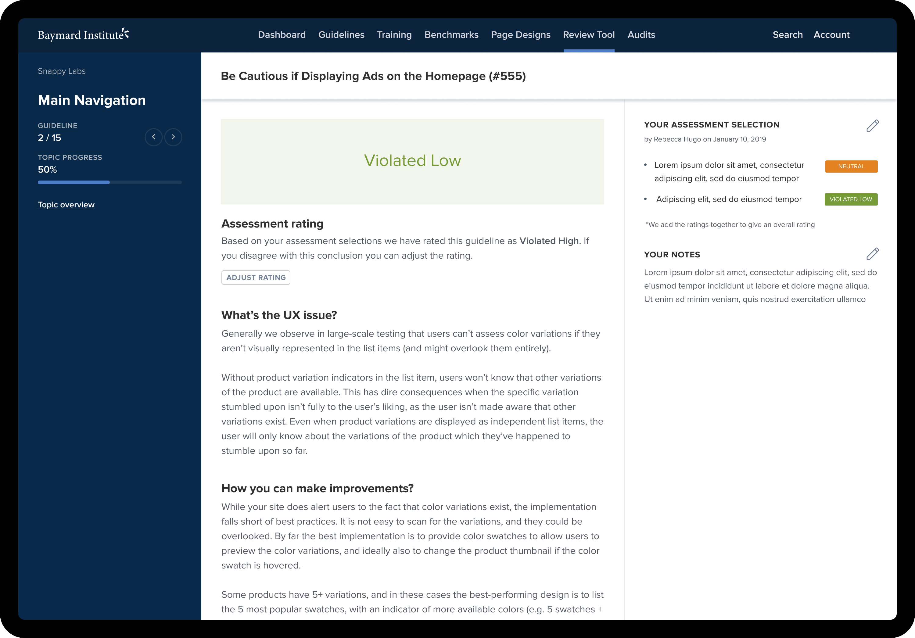
Review Tool
I helped design a self-audit tool that lets users review their own site—or any website—against Baymard Premium’s 700+ UX guidelines. It guides people through the process step by step, making it easy to track where a site’s doing well and where there’s room to improve. At the end, you get a scorecard showing exactly how your site performed, plus the option to compare your results with competitors. It’s a great way to spot quick wins and bigger opportunities for better UX.
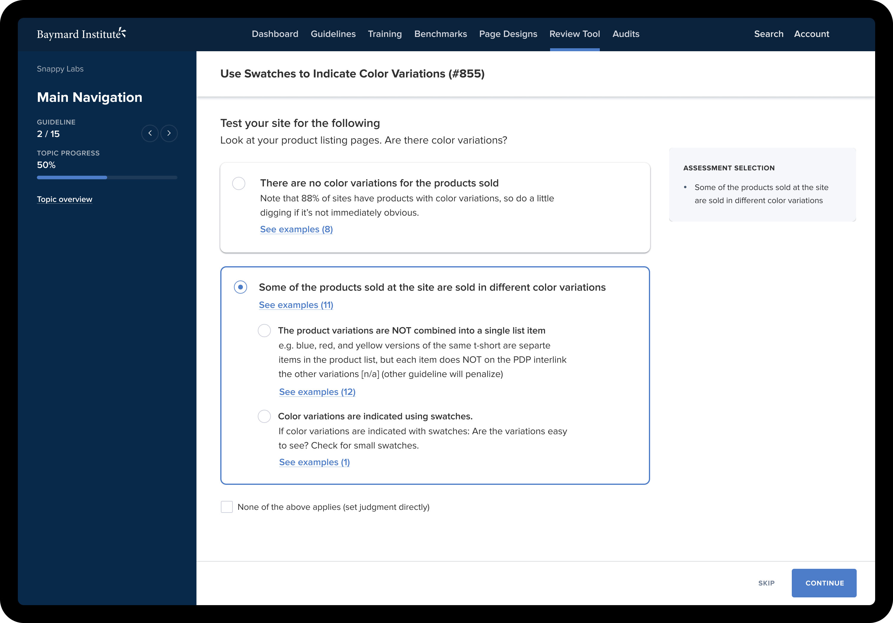
Activity Pages
I also worked on the design of activity pages where users can test different page types on their own site against a series of questions and tasks based on Baymard’s UX guidelines. The goal was to make the process clear, focused, and easy to follow, allowing users to assess key areas like product pages, checkout flows, and navigation. Each activity guides users through targeted evaluations, helping them quickly identify strengths, issues, and areas for improvement as they move through their audit.
Results
I designed the results pages shown at the end of each audit section to give users a clear, actionable summary of their performance. Each page provides an assessment rating and a detailed explanation of any UX issues found, along with practical guidance on how to improve. The aim was to make the feedback easy to understand and immediately useful, so users could prioritise changes and see exactly where their site met, exceeded, or fell short of best practices.